Design a Logo for volleyball club
- Status: Closed
- Nagroda: $80
- Uzyskane Zgłoszenia: 52
- Zwycięzca: marlopax

Opis Konkursu
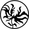
We’re looking for a revamp of our volleyball club logo to signify a new phase in the club’s life. The club’s been around for 20+ years and has for some time had a stigma attached to it of being the ‘older’ club in our league but these days our membership is much more varied (ages 15-60s).
We’d like a new logo that is modern, dynamic and more engaging than the one we currently have (see attached) but it also needs to be simple enough to be embroidered. Our history is important so we would still like the logo to reference our history in some way if possible. Ideally this logo should be engaging to potential athletes in the younger age brackets (15-35).
Feel free to use as many of the club colours as you like (black and white are also fine).
It can incorporate a volleyball (or not), chequered pattern (or not) and should include the club name in some form (can be just "Chequers" or the full "ECU Chequers Volleyball Club").
Use of the logo:
- our website and email
- our uniforms (sublimated and embroidered)
- club stationery/letterhead
Please note: an additional flat version might be requested once the winner is awarded for ease of embroidery (depending on the design). Happy to negotiate. If you are able to post the logo and a flat version/s that may help.
Club Name:
ECU Chequers Volleyball Club
Our club (PMS) colours are:
For matt paper- Red 186 Blue 288 Yellow 142
For gloss paper-Red 187 Blue 295 Yellow 142
We don’t want:
Retro
Zalecane Umiejętności
Opinie o Pracodawcy
“This freelancer did well - the logo submitted was fantastic, all tweaks were accommodated and a number of different options were provided. I was concerned about the name in the logo being spelled incorrectly but this was rectified during handover.”
![]() lynseymooha, Australia.
lynseymooha, Australia.
Publiczna Tablica Wyjaśnień
-
pipoypogi
- 10 lat temu
#49 my actual embroidery design for your logo.. Hope you choose me. thanks
- 10 lat temu
-
TradeGraphix
- 10 lat temu
Good morning, first of all I would like to say I really enjoyed working on your logo and I hope you like it. Editing, if any, can be done I have ideas for color placement but of course if the club committee has color placement request I can apply them for you anywhere you like. Please check out #68
- 10 lat temu
-

Organizator Konkursu - 10 lat temu
#all Hi everyone, thank you for entering the contest. Our club committee will be meeting on Tuesday and a winner will be selected within 7 days.
- 10 lat temu
-

ahmedelsayed93
- 10 lat temu
please check #69
- 10 lat temu
-

catrinaalex89
- 10 lat temu
- 10 lat temu
-

mansinhmori
- 10 lat temu
Check #34 and #35 .. Need change then let me know.
After ending of contest still u want some change give me private message or give feedback. :)- 10 lat temu
-
mansinhmori
- 10 lat temu
Hello Sir, Is there any changes you want in design then let me know. #45 #55 Thnx .. :)
- 10 lat temu
Wyświetl 1 wiadomość więcej
-
mansinhmori
- 10 lat temu
Ok I didnt get your private message but i'll change and submit a logo in few minutes.. Thnx for feedback. :)
- 10 lat temu
-
mansinhmori
- 10 lat temu
Hello Sir, Here as u suggest i insert ECU as your requirements. And in first i put ECU with some Arch and in 2nd it is flat. Which ever u want. still u want change in size or anything else let me know. Hope U LIke.
- 10 lat temu
-

johanmak
- 10 lat temu
hey sir, please give me feedback #61 and #58 thanks.
- 10 lat temu
-
Organizator Konkursu - 10 lat temu
#40 - the simplicity is good but it will be difficult to use this as a symbol on uniforms
- 10 lat temu
-

manuel0827
- 10 lat temu
- 10 lat temu
-
manuel0827
- 10 lat temu
They are the same just a better look on live images
- 10 lat temu
-
Organizator Konkursu - 10 lat temu
Ok thanks :)
- 10 lat temu
-
Organizator Konkursu - 10 lat temu
#2 and #3 - thanks Ahmed. These two are nice and simple with nice layouts. The main feedback for improvements would be that we would prefer 'Chequers' being emphasised rather than 'ECU'; the ball is an older style version; and the colouring, whilst it looks nice, washes out the name of the club on a white background.
- 10 lat temu
-
AhmedShokry2014
- 10 lat temu
I will make edits and send you more previews .....
Thanks for reply ..- 10 lat temu
-
Organizator Konkursu - 10 lat temu
#42 the effect with the ball is really nice, great job on using a swirl ball design.
- 10 lat temu
-
Organizator Konkursu - 10 lat temu
Unfortunately some of my private messages haven't been saved, so whilst I was providing individual feedback on some of these logos, you may or may not have received it. I'll post future feedback on this board.
- 10 lat temu
-

mahisahrifahmed
- 10 lat temu
Sir! Check My entry #37 or #38
- 10 lat temu
-
Organizator Konkursu - 10 lat temu
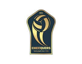
#49 - looks great, thanks for submitting. Are you able to submit the flat file please?
- 10 lat temu
-
mahisahrifahmed
- 10 lat temu
Black & White #39
- 10 lat temu
-
Organizator Konkursu - 10 lat temu
#26 @thimsbell are you able to do this logo using a volleyball please?
- 10 lat temu
-
Organizator Konkursu - 10 lat temu
#6 - this one feels quite messy and doesn't have a 'logo' feel about it. Also, punching the ball is something we would not be encouraging.
- 10 lat temu
-

mannyshieldsjr
- 10 lat temu
Thanks, I'll do another one along the lines one what I have been seeing. Btw, that was a "serve" more than hitting the ball, but I understand either way. Thanks again for the feedback!
- 10 lat temu
-
Organizator Konkursu - 10 lat temu
#12 - I like that the circular shape reminds you of a ball even though it doesn't specifically show a ball. However the colours and effects make it far too busy.
- 10 lat temu
-
Organizator Konkursu - 10 lat temu
#10 and #11 - thanks for submitting these. Whilst they do reference our old history, they need a more modern feel to them. I think the colours in 11 make it feel quite busy.
- 10 lat temu
-
KevinChoiKang
- 10 lat temu
please check #19 thank you
- 10 lat temu
-
Organizator Konkursu - 10 lat temu
#5 - we're an Australian club and with the maple leaf it implies the club is Canadian. The fonts and the style make it feel a bit older than what we're going for - I like the form of the person spiking though.
- 10 lat temu
-
manuel0827
- 10 lat temu
- 10 lat temu
-
manuel0827
- 10 lat temu
- 10 lat temu
-
manuel0827
- 10 lat temu
#14 Thanks
- 10 lat temu
-
manuel0827
- 10 lat temu
#13 Thanks
- 10 lat temu
-
Organizator Konkursu - 10 lat temu
#4 - I like the ball and the hand, the colours and simplicity are good. The stars seem a bit out of place and would like to steer clear of those because there are a couple of other clubs with 'star' in their name.
- 10 lat temu
-
Organizator Konkursu - 10 lat temu
#1 - thanks Amir, this is a bit too busy and will be difficult to embroider. The ball is also an older style version (panel shapes) and it's difficult to read the name of the club.
- 10 lat temu
-
devk1994
- 10 lat temu
Could you seal the contest please?
- 10 lat temu
-
Organizator Konkursu - 10 lat temu
@devk1994 thanks for asking the question. I prefer to leave it open so that designers can see the feedback for other designs and are not wasting their time submitting similar items that aren't suitable.
- 10 lat temu
Jak rozpocząć z konkursami?
-

Opublikuj swój Konkurs Łatwo i szybko
-

Uzyskaj Tysiące Ofert Z całego świata
-

Nagródź najlepszą ofertę Pobieraj pliki - Łatwo!