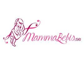
Design logo for MammaBebis.se (”MotherBaby”.se)
- Status: Closed
- Nagroda: kr1616
- Uzyskane Zgłoszenia: 145
- Zwycięzca: salutyte

Opis Konkursu
We need a great and lasting logo that can be our “landmark”, from start-up into well established and trusted web shop years ahead.
See below for part of the information/brief, but the full brief is contained in the attached PDF-file, and like more easily read there.
In the PDF is also our sketches and more on our own ideas, but we are welcoming creative alternatives.
The company - who we are:
MammaBebis.se is a small scale startup web shop company in Sweden. We’re aiming at providing good quality products that we believe are needed, or is a great help, to pregnant or nursing mothers and their infants. By providing these at reasonable prices and helping new home mothers / house wives to know what they need and what stuff they will do just as well without, we hope to help their economy so that they can stay home with their little ones a little longer, giving the children the best possible start at life.
...
Target customer group:
Our main customer group is going to be pregnant mothers or those who have small children at home....
Logotype / Brand:
...“MammaBebis.se” is what the logo should say.
...
The meaning and typing:
Mamma = Swedish word for mom/mommy/mother.
...
Bebis = Swedish word for baby (born or yet unborn)/infant/small child
...
.se = the Swedish top domain for internet addresses, and so also for our address.
...(“.SE” could be OK)...
Other comments:
...
• Fonts: Any font used in the logo(s) should of course be legal to use commercially for us in the logo(s)...Provide us with the full name of the font(s) used and who the provider is if we want to use the same font elsewhere.
• Colors:
o No gradients in logo
...
o Warm colors
• Stiles we like:
o Graceful texts and swirls
o ...
• Message: warmth, love, cuteness, graceful care
• Not primarily promoting high fashion or luxury, but the joy and gift of having children, and a bit “down to earth”/practical.
• Maybe a graphical retro touch or feeling of the housewives and home mothers of the 1940s and 1950s
• See PDF for further comments and info on our own design ideas and sketches.
Versions:
(1-3+ versions depending on the solution chosen and how well it scales):
1. Main version:
a. For the header in our web shop etc., and when printing about that size and bigger. This means that it should be easily readable and look good with a height of about 150 pixels (or lower, depending on the proportions below, a width more than four times the height means height will likely be reduced)
b. We believe the logo proportions should be at least twice as wide as it is high, probably around four times as wide. We’re no experts however, suggestions is welcome.
2. Small version/logo:
a. For small tags on our own textile products, and for ads and banners and other printing when it needs to be small (approx. height around 15-25 pixels) and still looking good and being readable (with “MammaBebis.se” of course). Might not be needed if the main version scales well, but likely it will be needed.
b. It should still be recognizable that it’s the same brand/company, connected with the main logo version in some way.
3. Abbreviated version/icon (depending on design chosen) – our idea/suggestion is just the M and the B put together in a “MB” – see the L3 - L5 sketches, on the right hand side.
4. As an appreciated bonus but not necessary – a 16x16 pixel icon picture for the browser tab, somehow connected with the logo. If this is the “MB” in small scale (if they are still readable at that size) or some other element/color picked up, that is up to you.
File formats:
• Vector based graphic: originals saved in a file format that can be opened using Adobe Illustrator CS3, as this is the version we have of the program
• For the ready to use files for the web, make a .PNG that has a height of:
o 150 pixels (main version)
o around 15-20 (max 25) pixels for the small version
o the abbreviated version, that too should have a height of 150 pixels
o and 16x1
Zalecane Umiejętności
Opinie o Pracodawcy
“Sandra’s level of artistic skill, along with high commitment and communication, left the other competitors far behind! Professional and good spirited despite many changes - we warmly recommend her!”
![]() MotherBaby, Sweden.
MotherBaby, Sweden.
Publiczna Tablica Wyjaśnień
-

Organizator Konkursu - 9 lat temu
___________________________________________
Hi everyone!
A big thank you to everyone who has sent in ideas and designs. Many designs where way better than our own idea in the brief - thank you!
I wish to let you all know the evening’s news:
We have now selected three finalists and we believe that the winning design are going to be among these three.
We are telling you all this now, since we do not want to let anyone waste their valuable time and energy.
We wish you the best, and thank you all again for your participation in our contest.
Respectfully,
CEO,
MotherBaby Company
___________________________________________- 9 lat temu
-
Bhairavid
- 9 lat temu
Have submitted entries in hope you may want to consider some more options. Thanks
- 9 lat temu
-
Bhairavid
- 9 lat temu
- 9 lat temu
-

GraphiqueStyle
- 9 lat temu
Hello Please check #209 Thanks
- 9 lat temu
-
GraphiqueStyle
- 9 lat temu
Hello Please Check #191 Thanks
- 9 lat temu
-

mbhattacharyya70
- 9 lat temu
Please check #188.
- 9 lat temu
-

enigmain992013
- 9 lat temu
Hi...
Please check my entry no.#177.- 9 lat temu
-
enigmain992013
- 9 lat temu
Check my entry no.#170 #171 #172 #173..Feedback us..
- 9 lat temu
-
enigmain992013
- 9 lat temu
Hi sir check my update entry no.#166
- 9 lat temu
-
enigmain992013
- 9 lat temu
Hi sir please check my update entry no.#161
- 9 lat temu
-
enigmain992013
- 9 lat temu
Hi sir check entry no.#162
- 9 lat temu
-
enigmain992013
- 9 lat temu
Please check my new entry no#156. Thank you.
- 9 lat temu
-
enigmain992013
- 9 lat temu
Entry no#157. Thank you.
- 9 lat temu
-

karimjaved
- 9 lat temu
- 9 lat temu
-

asadalirehan123
- 9 lat temu
please check #142..thanks
- 9 lat temu
-
asadalirehan123
- 9 lat temu
please check #141..thanks
- 9 lat temu
-
shivamsharmalko
- 9 lat temu
don't forget to rate.. #126 , #125
- 9 lat temu
-
enigmain992013
- 9 lat temu
Hi...
check my design - change update in entry no.#63 -
please check entry no.#131 #132 #133.
Thanks!- 9 lat temu
-
shivamsharmalko
- 9 lat temu
" Accurate brief " just gonna try to make it..!!
- 9 lat temu
-

prakashdarbha
- 9 lat temu
pls check #123
- 9 lat temu
-
prakashdarbha
- 9 lat temu
pls check #102
- 9 lat temu
-
mbhattacharyya70
- 9 lat temu
Please check art work and advice.
- 9 lat temu
-
Organizator Konkursu - 9 lat temu
Hi everyone! Sorry to say that today seems to fill up with other stuff I need to do, and the afternoon is booked with meetings. So feedback will be scarce (if any) during the day. Maybe some will be given during the weekend, but likely it will have to wait until Monday morning (we're on GMT+2 time wise).
- 9 lat temu
-
prakashdarbha
- 9 lat temu
check #102
- 9 lat temu
-

FlexKreative
- 9 lat temu
Hi, thanks for feedback, will submit new entries soon. Thanks
- 9 lat temu
-

bearpersson
- 9 lat temu
Hej! titta gärna inom #104 och klicka igenom bilderna!
- 9 lat temu
-

harunwiranto
- 9 lat temu
Hi, please see #105 . Hope u like it.
- 9 lat temu
-
GraphiqueStyle
- 9 lat temu
Hello Please Check #103 thanks
- 9 lat temu
-
prakashdarbha
- 9 lat temu
check #102
- 9 lat temu
-

darkemo6876
- 9 lat temu
please review #96 and feedback please. thank you
- 9 lat temu
-
mayareshu
- 9 lat temu
plz check entry #94 and give feedback.......
- 9 lat temu
-

iovita2013
- 9 lat temu
- 9 lat temu
-
Organizator Konkursu - 9 lat temu
Clarification #3
1) Repeat: No abstract art
2b) We’ve seen many that look like clipart/stock art – avoid that, we’ve also seen very nice submissions without such, and they will have a lot higher chance of being selected as winner. Make it yourself from scratch.
4b) Colors: After seeing so many entries, we feel that our idea on pink and/or purple might not be the best. You’re still welcome of course to use them, but don’t be locked to that. Some of the better designs has tried with WARM versions of red, yellow and even orange.
5) CHANGE: Some have tried well a design ideas in the brief (L1-L5), but we have realized that it seems both hard to get to look good, and also that many have submitted other ideas that we think is better so far. So have your own idea! But we do want the mother and the baby in there somehow.
6) Proportions: Many designs looks very high and not so wide. We can’t have to high of a logo, to fit the header of the web shop.- 9 lat temu
-
Organizator Konkursu - 9 lat temu
Hi everyone!
I’ve now sat down with the CEO, and together we’ve gone through most designs and taken some notes (new ones coming in faster than I can type the responses). We’ve noticed a few things which is to be clarified to everyone here, see Clarification #3.
I’ll try to respond/give rating out as quick as possible.- 9 lat temu
-

SivaKarthiDot
- 9 lat temu
reviews please
- 9 lat temu
-
enigmain992013
- 9 lat temu
Hello sir...
Kindly check my entry no.#71 & #72 both are same but different in color shade and variation an used worm color.
Thanks!- 9 lat temu
-
enigmain992013
- 9 lat temu
Kindly Check #66 #67 #68..Thank you.
- 9 lat temu
-
enigmain992013
- 9 lat temu
Please check entry no#63 , #64. Thank you sir.
- 9 lat temu
-
enigmain992013
- 9 lat temu
Please check entry no#61. Thank you sir.
- 9 lat temu
-
anandmn85
- 9 lat temu
Please check # 45 and #59
- 9 lat temu
-

theocracy7
- 9 lat temu
- 9 lat temu
-
iovita2013
- 9 lat temu
Please check #44
- 9 lat temu
-

hassaanid2012
- 9 lat temu
Provide feedback on #40
- 9 lat temu
-

pjrrakesh
- 9 lat temu
Check #41 Thanks!
- 9 lat temu
-

MeYaqoob04
- 9 lat temu
Please like and check #39
- 9 lat temu
-
GraphiqueStyle
- 9 lat temu
Hello Please Check #35 and any feedback thanks
- 9 lat temu
-
Organizator Konkursu - 9 lat temu
K, have to head our of office for the day, I'll be back tomorrow with feedback and excitement! Sorry for those whom I have not had time to comment yet, should get to it tomorrow. Thanks again for all submissions!
- 9 lat temu
-

orange712
- 9 lat temu
please check #27 it is a rough draft. If you don't care for the design I won't pursue it. A lot of work goes in to the final design and I don't want to waste my time and yours. Thanks for understanding.
- 9 lat temu
-
Organizator Konkursu - 9 lat temu
Clarification #2 ( #1 is further down and still applies)
A few clarifications might be needed, things we might have missed in the brief or previous clarifications:
3) Emphasizing a bit about the text – we think it should be gracious and swirly, more toward the “script” section of fonts than the more straight and rigid we’ve seen in many submissions so far. However, it’s the total that makes it, so in some cases there might be so much of this in the art, that the text should be relatively clean to be readable and the overall logo well balanced.
4) Colors: We are not certain about the pink and purple it’s just our idea. You are welcome to play around with other colors as well, but try to keep it to warm colors.
Please check back here, as we might find out more things we need to clarify during the run of the competition- 9 lat temu
-
Organizator Konkursu - 9 lat temu
Hi everyone!
We try to give comments and rate submissions as quickly as possible, but you are quicker to send in new ones :) We’ll try to get to everyone asap., submissions we like gets priority. We will leave response mostly during office hours (8-17 CEST (GMT+2)), even if we might take a sneak peak and leave a comment in the evenings from time to time.- 9 lat temu
Jak rozpocząć z konkursami?
-

Opublikuj swój Konkurs Łatwo i szybko
-

Uzyskaj Tysiące Ofert Z całego świata
-

Nagródź najlepszą ofertę Pobieraj pliki - Łatwo!